Nutrition Visualization
Interactive graphic using nutritional data
Work in progress
Timeline: March 2022 - May 2022
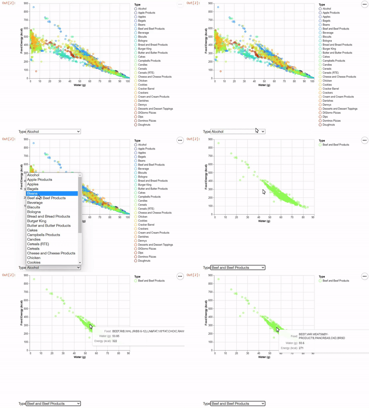
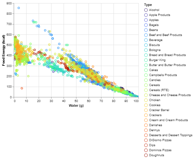
For this project, I used Altair, a statistical visualization library for Python, to create an interactive scatter plot containing nutritional data about a number of foods in certain categories.

A gif showcasing the visualization's functionality, including a drop-down menu and interactive tooltips.
Data information and source
- For this project, I used food nutrition data published by the USDA, which I condensed and sorted into related food groupings. I then used the Altair library's functions to map these groups and the associated nutritional data onto a scatter plot.

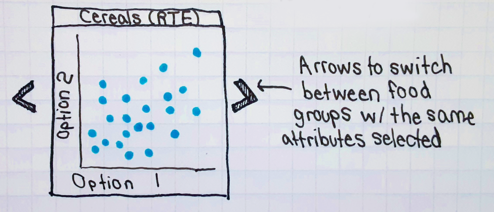
A rough concept sketch of the visualization to be created. The design's functionality was eventually modified, as seen above.

A static version of the finished visualization.